As you may know, Pantone – THE color authority – releases color trends twice a year, once for Spring and then again for Fall. In September it released the Fashion Color Report for Spring 2017, and I’m excited to say we can look forward to a brighter, more energetic color palette as we enter the new year!
Fashion Color Report Spring 2017
Fall 2016 was inspired by the desire for tranquility, strength and optimism, so the colors were soft and soothing. But, 2017 is going to spice things up in the color world, with a combo-palette of vibrant brights and lively natural colors. Leatrice Eiseman, Executive Director of the Pantone Color Institute had this to say about next year’s spring colors:
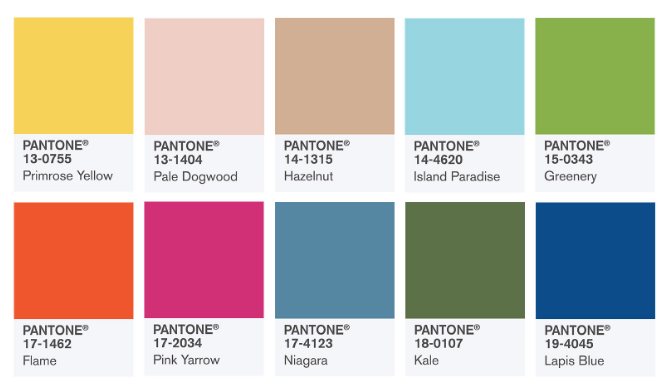
“Reminiscent of the hues that surround us in nature, our Spring 2017 Fashion Color Report evokes a spectrum of emotion and feeling. From the warmth of sunny days with PANTONE 13-0755 Primrose Yellow to the invigorating feeling of breathing fresh mountain air with PANTONE 18-0107 Kale and the desire to escape to pristine waters with PANTONE 14-4620 Island Paradise, designers applied color in playful, yet thoughtful and precise combinations to fully capture the promises, hope and transformation that we yearn for each Spring.”

While these colors are set in conjunction with what is spotted on the walkway in New York Fashion Week, they leak into every aspect of life that depends on color. In addition to clothing retailers, you’ll see these colors seep into your home décor, paint, nail polish, office supplies, furniture, accessories, and more. Once holiday wraps in retail stores you’ll see an overwhelming amount of these exciting and earthy tones start popping up everywhere; and if you’re like me – you won’t be upset about it!
How to Incorporate 2017’s Hottest Colors in Your Life
These colors are the perfect balance of soft, bright and serene, and they’ll be excellent inspiration for lighting used in homes and office spaces. With so many color options you still have the flexibility to stick to your style, but the new trend gives you a reason to spruce up anything that feels dated or tired.
And, that doesn’t have to mean a big expensive redecorating or remodeling project. While we love a decoration overhaul as much as the next home décor and lighting enthusiast, it isn’t always necessary. Quite often, swapping out one or two decorative elements in your space can make a world of difference. If you want to try lighting, start by looking at lamps – table-top or floor. If you want a more dramatic change, and are willing to spend a little more, then look to your chandelier. Because a chandelier is often the focal point in a room, swapping with a new fixture will be something everyone notices.


Other simple changes you can try are new throw pillows, new paint color on an accent wall (or wallpaper to incorporate a bold pattern), or new wall art.
We’re heading into a new year with new colors. This fresh start is the perfect excuse for something new – in your wardrobe, in your purse, or in your home.